
Inspiration:
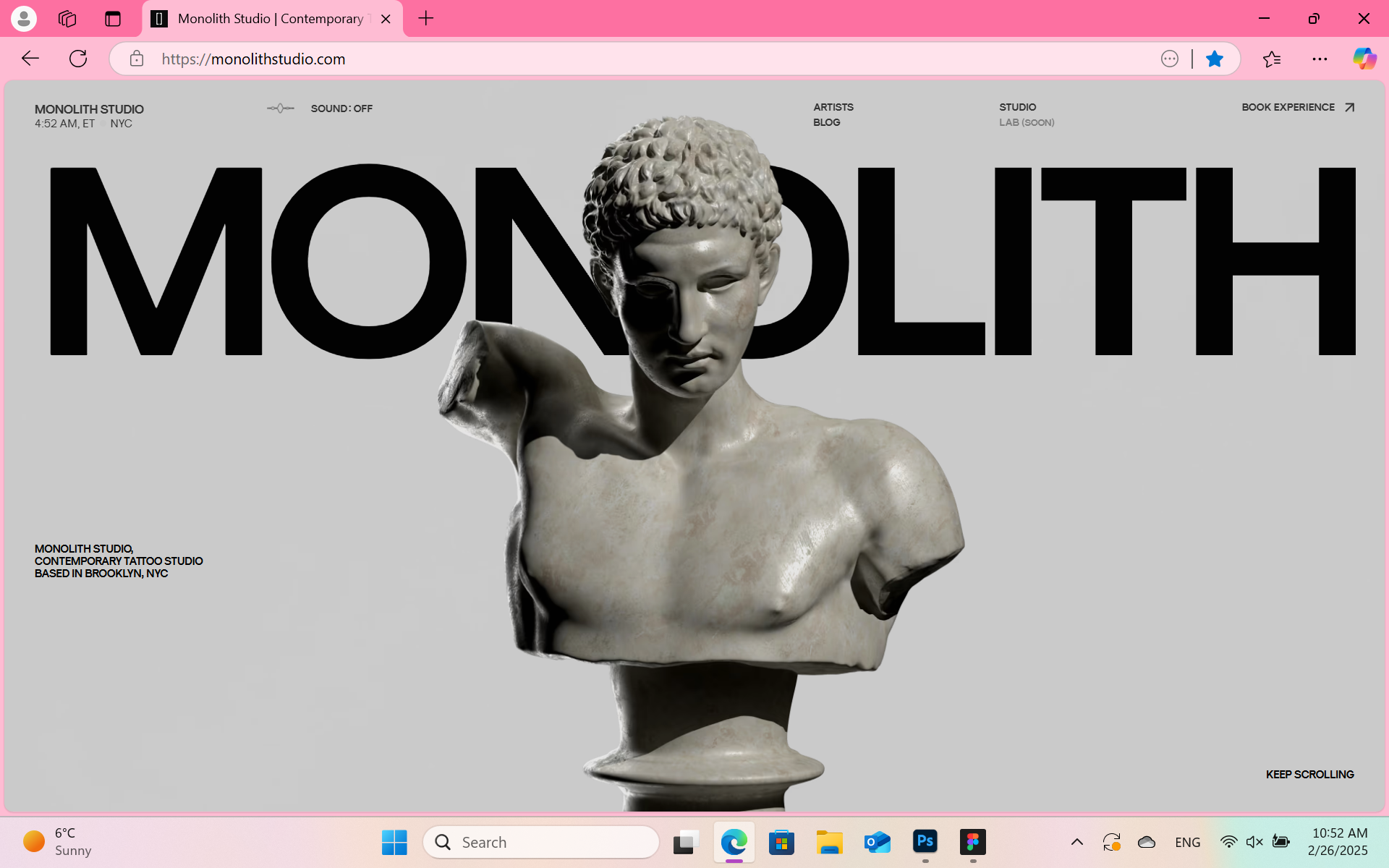
For the design of my portfolio, I took a lot of inspiration from the VOGUE magazine since I want my website to look like a high-end magazine. The layout and the typography were influenced by the VOGUE aesthetic. I also got inspired from Monolith Studio website about its modern layout and the 3D animation that I also want to include in my portfolio.
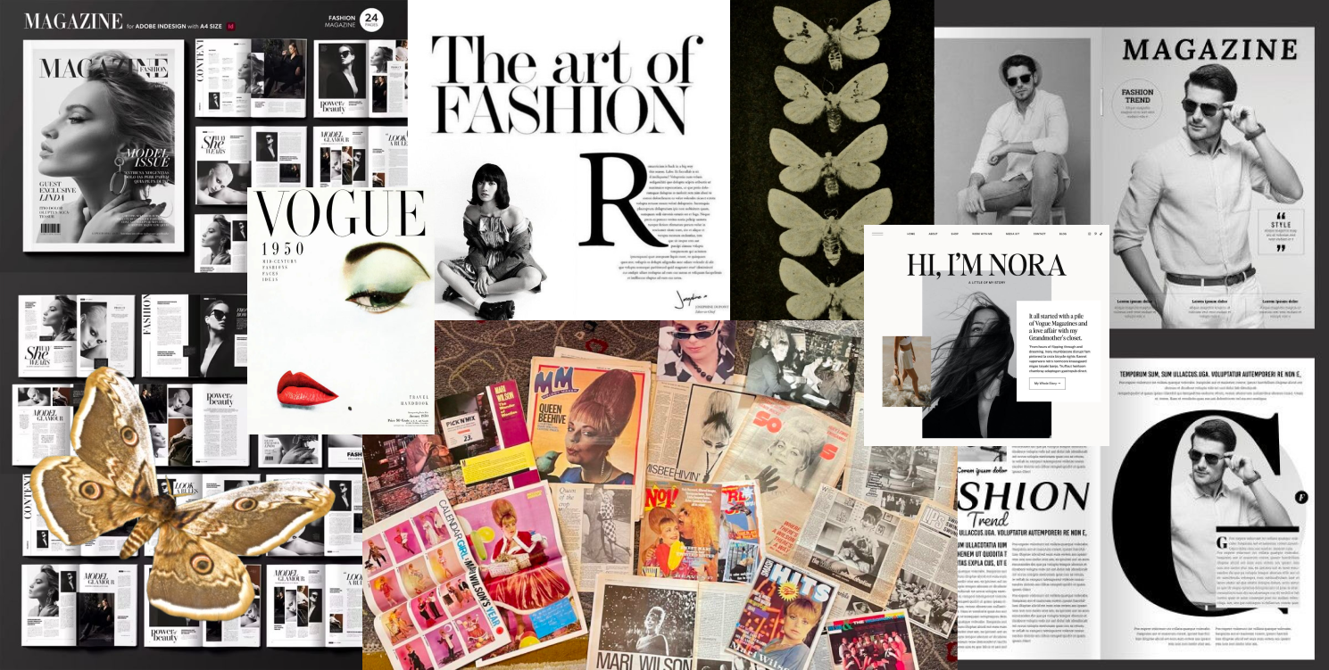
Mood board:
I took a lot of inspo for it from Pinterest to help me create a mood board that is resonating with the desired from me design
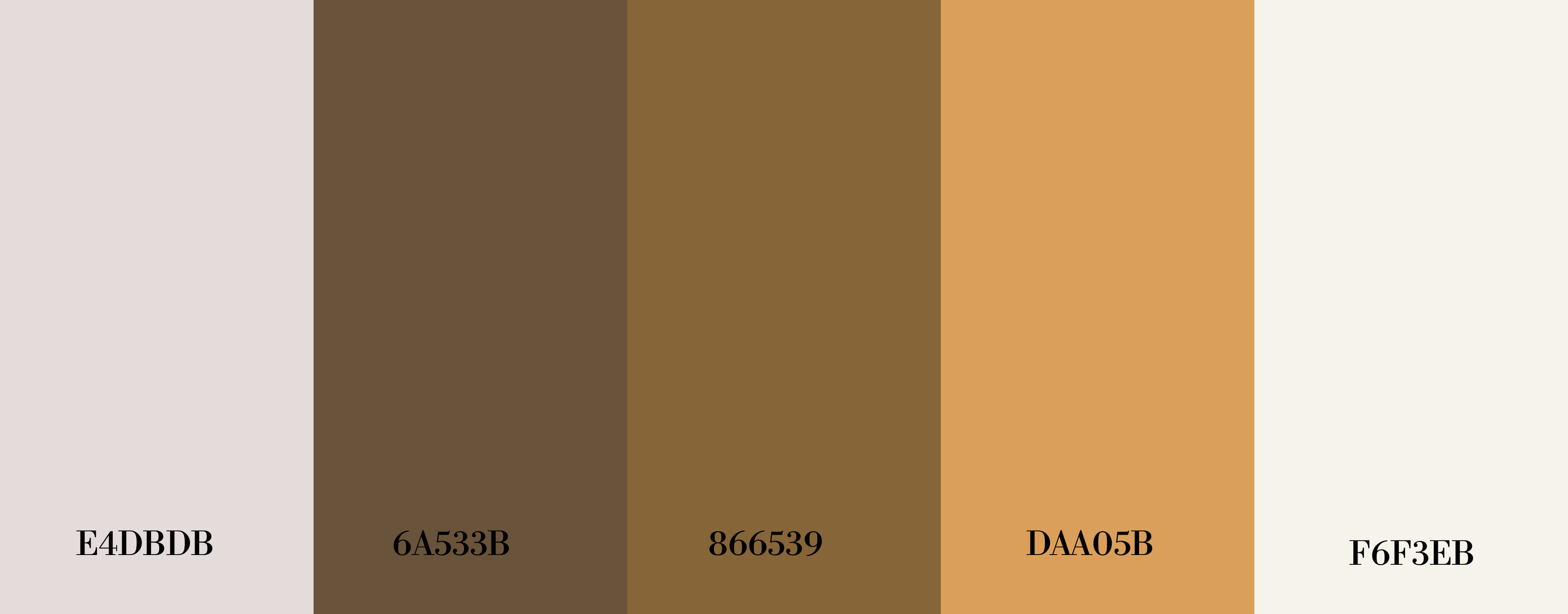
Colour palette:
This is my color palette so, the colours I choosed based on what kind of colours the moth has in it's wings and the background colour- I wanted to give a magazine vibes so I made it a more of a dirty white colour.
Prototype process:
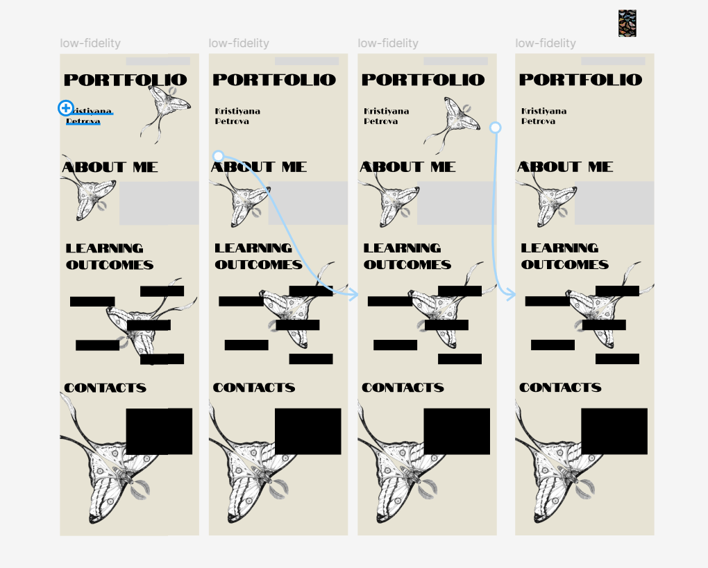
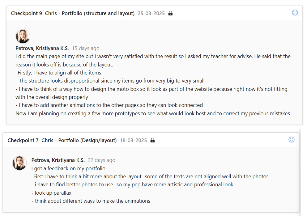
I started with simple prototype more of a low-fidelity, where my main element was the moth flying through the pages of my website. However, after receiving feedback, I realized that the animation would be both too distracting but also too hard for me to do.
So I decided to still keep the moths as a main part of my portfolio, but to simplify it. Then I created more of a mid-fidelity prototype which again got some layout changes after talking with my teachers, I made some further changes and adjustments based on the feedback. This changes improved usability and the visual appiriance of my portfolio.
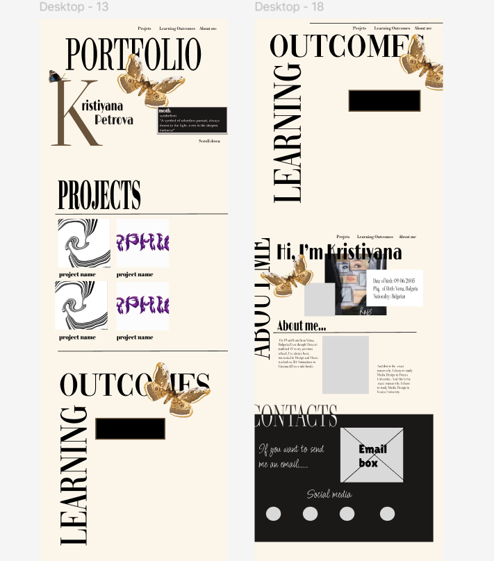
After doing third and final redesigning- a high-fidelityone, which was approved from the teachers and with which I was satisfied with I began coding it into working website.
Developing process:
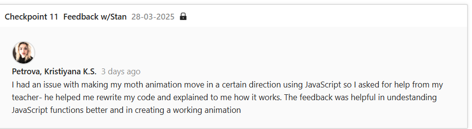
After fixing my layout to a level where I was satisfied with, I wanted to add the animation.Originally, I wanted to use a free 3D model of a moth, but I couldn’t find one that worked well. That issue I fixed by making a GIF image of the moth by using images of the moth in different poses. After that I began coding its movements but there again was a problem with the script- the moth wasn’t moving in the correct direction. After trying to fix it myself, I asked my teacher for help. He helped me rewrite the script and explained to me where the problem was. After getting feedback from him, I used what he showed me to write a script for the other moth animations myself.
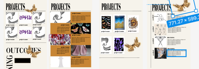
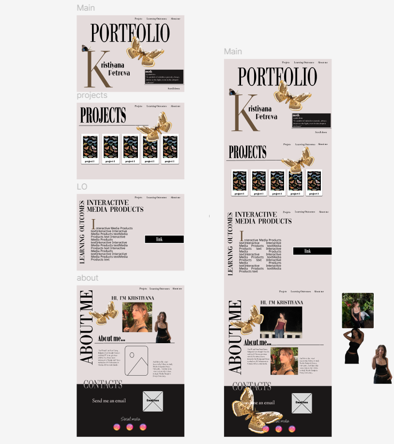
The next part of building my portfolio, was to add the projects and the learning outcomes to the website. In my prototype, I had planned to use cardboxes to display the project but I couldn’t decide how to style them. So after another talk with my teacher, he gave me advise how to design them, from which I got inspiration and created the cardboxes you see now.
Git repository:
I created Git repository, invited my teachrs so they could be able to view my project, wrote a detailed README file and made sure to push in Git regularly.
User-testing:
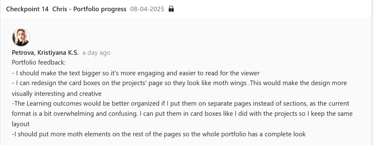
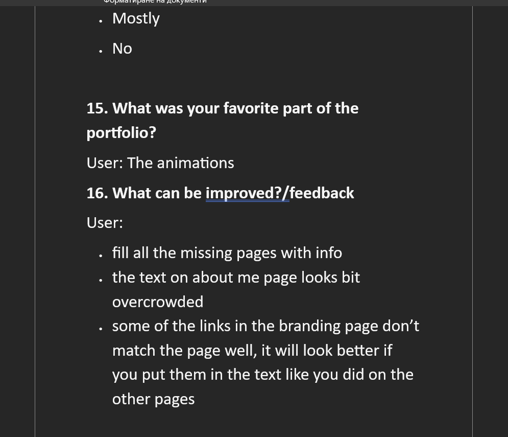
Once my portfolio was nearly complete, I conducted a user-test to gather feedback on the design, navigation, and overall experience. The users described the design as visually appealing, but had some notes about the design on some of the pages. Based on the feedback I got I made final changes to my portfolio.
Reflection:
’m really happy with how my portfolio turned out. It reflects my personality and design style, and I was able to combine creative visuals with clear structure. I learned a lot about interactive web design, consistency in layout, and the importance of small details like button styling and font choices. Most importantly, I realized how helpful feedback is – it helped me catch things I missed and improve the user experience. I’m proud of the result and I’m excited to keep improving in my next projects.