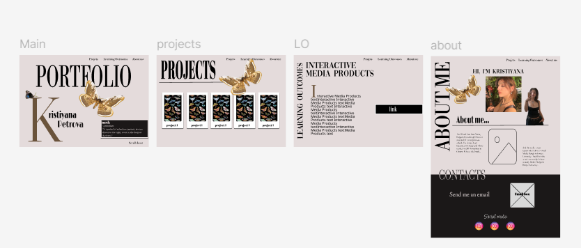
Introduction:
I created an interactive prototype of my portfolio website using Figma. I wanted my portfolio to be a combination between a high-end magazine layout like VOGUE and to have a 3D elements like Monolith Studio website.
What did I do:
I started with prototyping my first idea which was entirely inspired by the Monolith Studio website - I wanted to incorperate the 3D image- a moth that is flying through the screen while you scroll. But after crating my first prototype where the flying moth was the main focus of the pep, I got to the conclusion that it doesn’t look as good as I thought in my head. Another problem with this design occurred when I talked with one of my teachers. He said that if I have this 3D effect on all of the pages, it will be distracting from the main focus of the website- the learning outcomes. So then I created another prototype- a magazine-like website, still having the moth element but I made it way smaller and more simple – more like a detail to the website design rather than the main focus.
How did it go:
Overall, the creation of the prototype went well. After getting feedbacks from my teachers, I made some small adjustments- the positioning of the pages- the more important ones like Projects & Learning outcomes- to be before the About me page. I also changed some of the fonts so it’s not overwhelming.
What I learned:
I learned the importance of testing different ides out at the beginning, because sometimes when you think that a design looks good in your head, it may not look as good when you create it. I also learned that it’s very important to show the prototype to your teachers while designing it, so they can give you useful opinion.
Reflection:
Next time, I would focus more on early prototyping and testing before entirely commiting to an idea. While the 3D animation seem cool, I know realize that it is essential to ensure that all elements align with the overall design and that a simple version is better than an overcomplicated one.

Introduction:
For my personal portfolio project, I focused on creating an animated element so my website could be more dynamic and have something that feels more unique.Since moths are main design element in the website I wanted to give them life through animation.
What did I do:
I started by searching 3D model of a moth from websites that offer 3D animations. After finding one 3D model, that fits the style I wanted, I made multiple screenshots of the moth in different positions of its’ wings so it can simulate movement. I then removed the background of all of the images to make them transparent and used online tool EZGIF to turn the frames into a looping GIF.After getting feedback, I realized the movement wasn’t dynamic enough and looked a bit too stiff. So I took more screenshots of the moth in even more positions and then made it into GIF. This time the animation looked a lot more smoother and realistic..After the animation was done I conducted a user-test, from where I find out that the user likes the animation and finds it engaging.The animated moth is not just a visual element- it reacts to user interaction. When the user scrolls down the page, the moth appears and follows a path across the screen, creating a sense of motion.
How did it go:
The process was definitely something new for me because I have never made a gif neither I have implemented it in a code before. It took a lot of trials to have my finished model now. The feedback I received during this process was really helpful and pushed me to refine the animation further.
What I learned:
I learned a new way of doing animations. In the beginning I was planning to download ready to use 3D model but since I couldn’t find one, I had to create it myself. The process thought me that it is important that not give up on my ideas if something does not works out how I thought and to always search for another way to do it.
Reflection:
This experience showed me how interactive media can be a powerful tool. In the future, I’d like to experiment more with animated elements and explore other techniques.

pic. 1

pic. 2
pic. 3
pic. 4
Introduction:
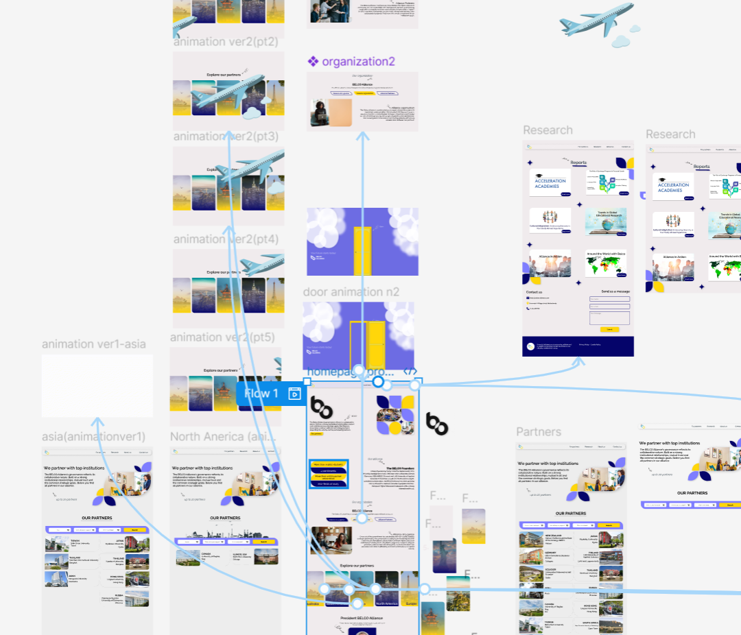
As part of the Development project, I was responsible for designing and implementing an interactive plane animation for the Partners page of the Belco Alliance website.Using the feedback that we got from the user-test my goal was to make the site more engaging and visually dynamic by having a plane fly across the screen when “Explore our partners” page loads.
What did I do:
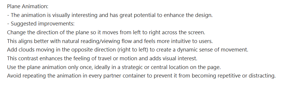
To create the animation, I used two photos – of a plane and of clouds. I used the code of the moth animation from my portfolio website as a foundation. Although the moth animation was triggered by scroll rather than page load, it gave me a useful starting point. I reused and adapted the animation code to fit the needs of this project, ensuring it triggered automatically when the page is opened. After that I conducted one more testing with a teacher and he suggested to make the clouds and the plane move in different dirctions.(pic. 3) In addition, I collaborated with a friend who helped me in refining the JavaScript since I had a bit of a difficulties with making the plane image and the clouds one to move in opposite directions.-(pic. 4)
How did it go:
The animation was successfully implemented and provided more interesting effect to the whole website without distracting from the main content. Adapting my old code saved time while also allowing me to focus on improving its functionality.
What I learned:
This task helped me understanding how animations can guide user attention. I deepened my knowledge of JavaScript and learned how to trigger animations based on user actions such as page load. I also learned how I can make two animations work like one which was something I haven’t done before.I also saw how small changes—like adjusting speed or direction—can significantly improve the user experience.
Reflection:
Through the process, I grew more confident in implementing and adapting interactive features . Going forward, I plan to keep refining my skills in JavaScript by experimenting with more advanced interaction techniques in future projects.
pic. 1
pic. 2
pic. 3
Introduction:
For the development project, I was responsible for designing and implementing interactive animations in Figma, including making the entire prototype fully interactive.
What did I do:
I created two animation variations specifically for the partner boxes on the website: one where a plane flies across the screen when a box is clicked-(pic. 1) and another where the plane pulls the next page into view as a transition effect.-(pic. 2) I did both of the animations using tools in Figma to help me animate them and make them interactive so they work when a cardbox is clicked. I added both of the animations in the prototype, as an examples -so we can conduct a user-testing for them and see which one suits the overall website design better. I also focused on building an interactive prototype of the website that accurately simulates the full user experience.-(pic. 3)
What I learned:
Making the entire prototype interactive allowed more effective user-testing. It helped with gathering targeted feedback and spot usability improvements early in the design process.
Reflection:
This experience strengthened my understanding of interaction design and the role of animation in user experience. I became more confident using different tools in Figma to animate objects.
Introduction:
For my personal portfolio project, I aimed to create a website that reflects not just my skills but also my personal style. I wanted to make my website feel interactive and alive.
What did I do:
The first interactive element I added was animated moth throughout the website. The moth is a key design symbol in my portfolio, and by animating it across different pages, I was able to bring unique personality to my whole portfolio. Another interactive element was on the Learning Outcomes page, where I created cardboxes shaped like moths. When users click these cardboxes, they slightly shake, mimicking a moth fluttering its wings. The text structure on the Learning Outcomes page is also interactive- I designed it so that clicking on different headers reveals different texts related to that specific outcome. This design choice keeps the layout clean and improves readability.
How did it go:
These interactive features were well-received during the user test. Users described the site as “interactive, visually appealing, and innovative,” with animations being one of their favorite parts of the overall experience. Knowing that users found these interactive elements both engaging and enjoyable confirmed that the design I made was good.
What did I learn:
This project deepened my understanding of how interactive media design can enhance usability. I learned how small touches—like a shake animation- can improve how users experience and navigate a site. I also learned how to build more complex animations using JavaScript.
Reflection:
Creating a portfolio that has interactions allowed me to show more than just my technical skills—it also let me express creativity. The process helped me realize how design and interactivity can work together to create a site that feels personal, engaging, and user-friendly. I’m proud of how users reacted to the animations and layout, and I look forward to exploring more creative ways to connect with users in future digital projects.
Introduction:
As part of the development project and the building of Belco Alliance website, I was responsible for developing the “Explore Our Partners” page, the Partners page, and the Contact page. My goal was to create interactive elements that would improve the user experience by making the site easier to navigate, more engaging, and more functional.
What did I do:
To enhance user engagement, I added an animated plane that appears when the user opens the “Explore Our Partners” section. This visual animation creates a more dynamic experience. On the Partners page, I implemented a search and filter system. Users can search for partner universities by continent, program, or university name. This functionality helps users quickly find the information they need without having to scroll through a long list of institutions. On the Contact page, I included an interactive form that allows users to send messages directly to the client’s email. This gives users a fast way to get in touch, ask questions, or request information, without needing to open their own email apps. In addition, I made all of these pages responsive, so that users can interact with the site across different devices.
How did it go:
Implementing these interactive features took time and testing, especially the search bar, but it was rewarding to see how they improved usability. After the final presentation, I got some notes on what I can change to enhance the user experience better- the contact box design doesn’t really match the visual style of the rest of the site and could use a redesign, as well as the placement of the text within the university card boxes which could be improved.
What did I learn:
I learned how to structure search filters to improve navigation, and how to use animations without overwhelming the user. I also became more confident in making pages responsive and ensuring that interaction works consistently across all devices.
Reflection:
This project helped me understand how small interactive choices can have a big impact on the user experience. Going forward, I want to keep improving the way I design interactive elements by combining visual appeal with usability and accessibility.
Introduction:
For Project X, one of my main goals was to create an immersive and interactive virtual experience that allowed users to engage with art in a meaningful way. I didn’t want the gallery to feel like just a static website or slideshow-I wanted the user to be able to explore the gallery on their own.
What did I do:
To make this experience interactive, I designed a digital gallery where users can freely move around using their keyboard. They can use both the arrow keys and the W, A, S, D keys to explore, giving them control over how they navigate the space. From the main menu, users can choose to enter the gallery either by pressing "Enter" on the keyboard or clicking a button. I also made sure they can return to the menu anytime by pressing "Esc".As they explore, they can look around with their touchpad and unlock the pointer by pressing the spacebar, making the experience more game-like. I also added background music to create atmosphere, which users can turn on or off depending on their preference. Another key interactive feature is the information boxes that appear when users get close to each painting. Each box contains the painting’s title, artist, and a short description- adding depth to the experience and encouraging users to engage with the artworks, not just look at them.
How did it go:
After conducting user testing, I realized that not all users immediately understood how to interact with the gallery. Based on this feedback, I added clear instructions on the menu screen that explain all the available controls. This small addition made a big difference in helping users to understand how to navigate the gallery.
What did I learn:
Through this process, I learned how important it is to think from the user’s perspective. Creating an interactive product isn’t just about adding movement or features-it’s about guiding the user, and making sure their experience is smooth and easy to understand. I also realized how even small additions, like the ability to turn music on or off, can give users more personal control over their experience.
Reflection:
Overall, I’m proud of how interactive and engaging my virtual gallery turned out. It allows users to move freely, interact with content, and feel like they’re truly exploring a digital space. This project helped me understand the value of interaction in media products—not just to impress the user, but to make them feel involved in the experience.
Introduction:
As part of developing my personal portfolio website, I wanted to ensure that the design was not only visually pleasing, but also accessible and user-friendly across different devices.
What did I do:
To achieve this, I made the entire portfolio responsive, using media queries, scalable images , and rems to adapt the design for different screen sizes. I tried to avoid issues like overlapping elements, unreadable text, or cut-off content. I made sure than interactive features, such as the animated moths and clickable learning outcome sections, were still working on smaller screens.
How did it go:
Making the site responsive took time especially because of the custom animations, but I am happy I added this feature.
What did I learn:
This process taught me how important responsive design is in creating a professional and accessible website. I realized that a great design is only effective if users can actually interact with it comfortably, regardless of the device they’re using.
Reflection:
Making my portfolio responsive wasn’t always easy, especially with the custom animations and design elements I included. But it was an essential part of the process and is a valuable skill for any future projects or professional roles.